2.0 Min Read…
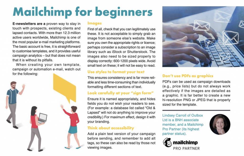
Article in Business North Harbour Association (BNH) FYI magazine concentrating on the 5 most common mistakes using Mailchimp.
E-newsletters are a proven way to stay in touch with prospects, existing clients and lapsed contacts. With more than 12.3 million active users worldwide, Mailchimp is one of the most popular e-mail marketing platforms. The basic account is free, it is straightforward to customise templates, and it provides useful campaign analytics – but that does not mean that it is without its pitfalls.
When creating your own template, campaign or automation e-mail, watch out for the following:
Images
First of all, check that you can legitimately use these. It is not acceptable to simply grab an image from someone else’s website. Make sure you own the appropriate rights or licence; perhaps consider a subscription to an image library such as iStock or Shutterstock. The images also need to be sized properly to display correctly: 600-1200 pixels wide. Avoid small text on these; it will not be easy to read.
Use styles to format your text
This ensures consistency and is far more reliable and less time-consuming that individually formatting different sections of text.
Look carefully at your “sign form”
Ensure it is named appropriately, and hides fields you do not wish your readers to see. (For example: a database list called “Old & Lapsed” will not do anything to improve your credibility.) For maximum effect, design it with your branding.
Think about accessibility
Add a plain text version of your campaign before sending, and remember to add alt tags, so these can also be read by those not viewing images.
Don’t use PDFs as graphics
PDFs can be used as campaign downloads (e.g., price lists) but do not always work effec-tively if the images are detailed as a graphic. It is far better to create a new hi-resolution PNG or JPEG that is properly sized for the template.


Leave A Comment
You must be logged in to post a comment.